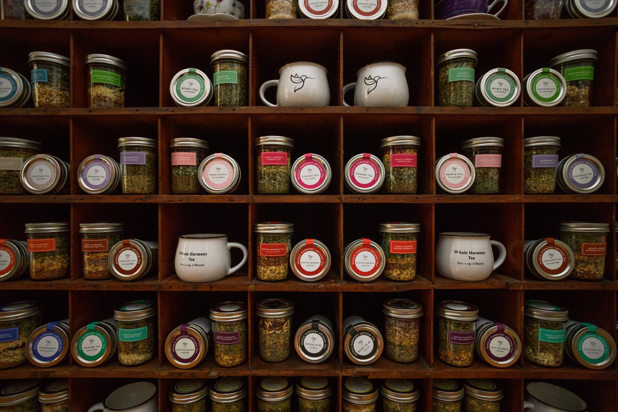
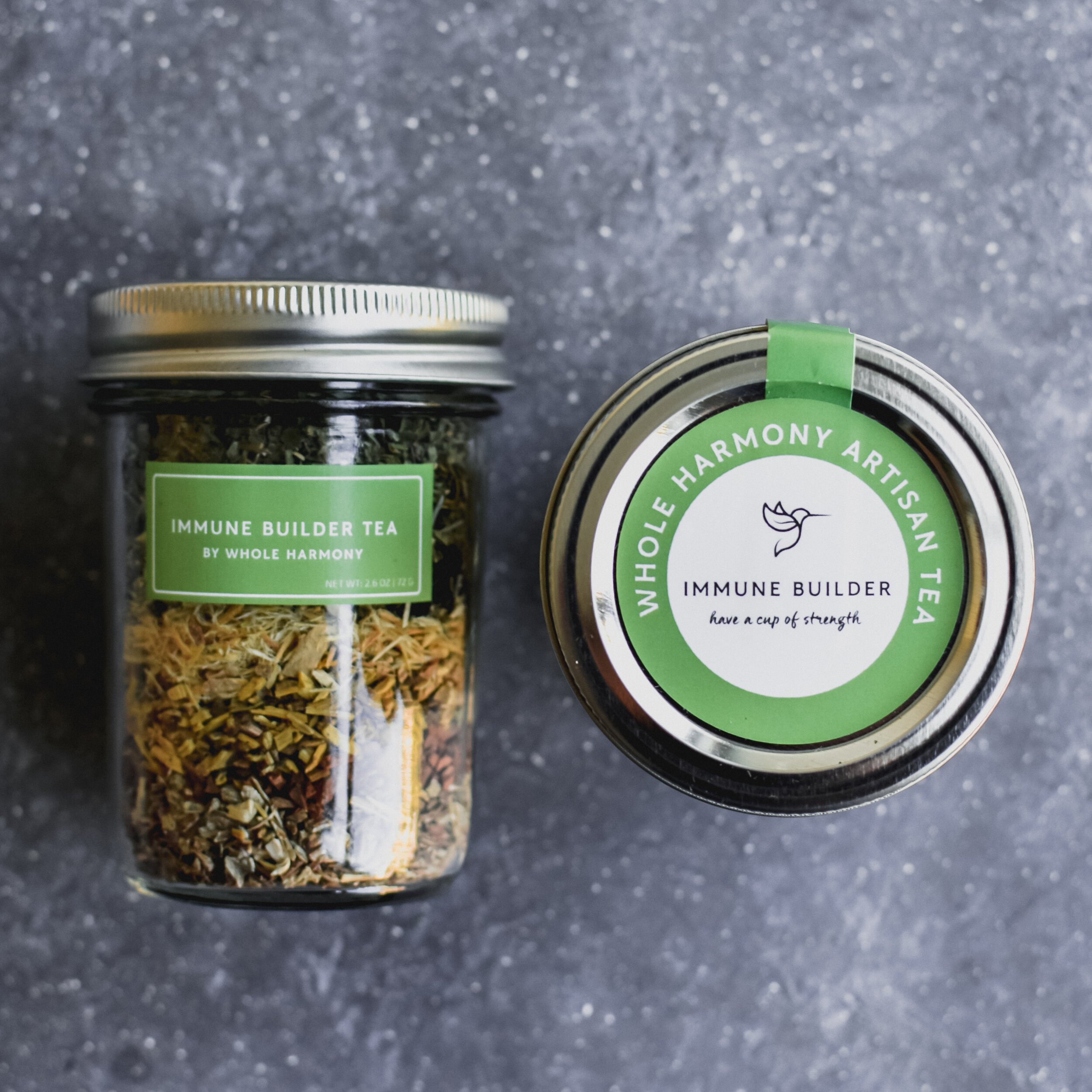
When assigned the responsibility of modernizing and harmonizing their existing brand elements, our team recognized that allowing the products to shine was the most crucial artistic direction we could pursue. With this in mind, we opted for a minimal and neutral color palette and style for the brand packaging. To further enhance the brand's identity, we introduced a symbolic icon, a hummingbird with a tea leaf-shaped wing, representing prosperity and rebirth.
The result was a nature-forward visual system that exudes both quality and passion while maintaining a genuine and authentic feel. The hummingbird icon serves as a powerful symbol of the brand's essence, creating a unified and cohesive identity that perfectly captures the essence of the products within.
AGENCY: Box 8 Creative
ROLE: Lead Designer