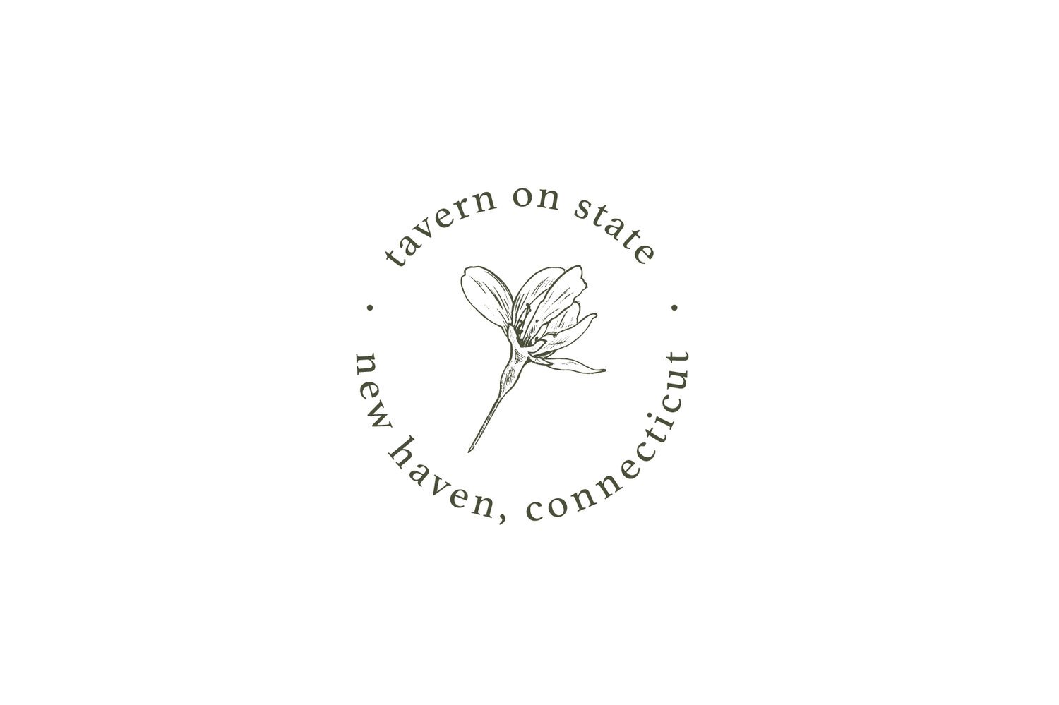
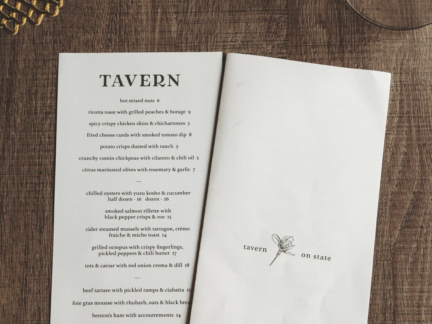
The team meticulously crafted a comprehensive brand that beautifully reflects the spirit of New Haven. By hand-picking, drying, and sketching cherry blossom flowers from Wooster Square, we created a nostalgic yet modernized element that features prominently, both alone and in harmony with a revamped "tavern" typeface. Playful elements inspired by the restaurant's iconic iron gate were thoughtfully incorporated, adding a touch of character.
Despite the intricacies of the design, Tavern On State maintains an inviting and unpretentious atmosphere—a humble neighborhood spot offering delicious American cuisine done to perfection. The brand captures the essence of New Haven, creating a warm and welcoming ambiance for all who step through its doors.
The craft that went into the brand development, not to mention the meaning behind it, is quite special. From tree, to tablet, to table: the branding for Tavern on State could not be any more authentic to the city it serves.
AGENCY: Box 8 Creative
ROLE: Lead Designer